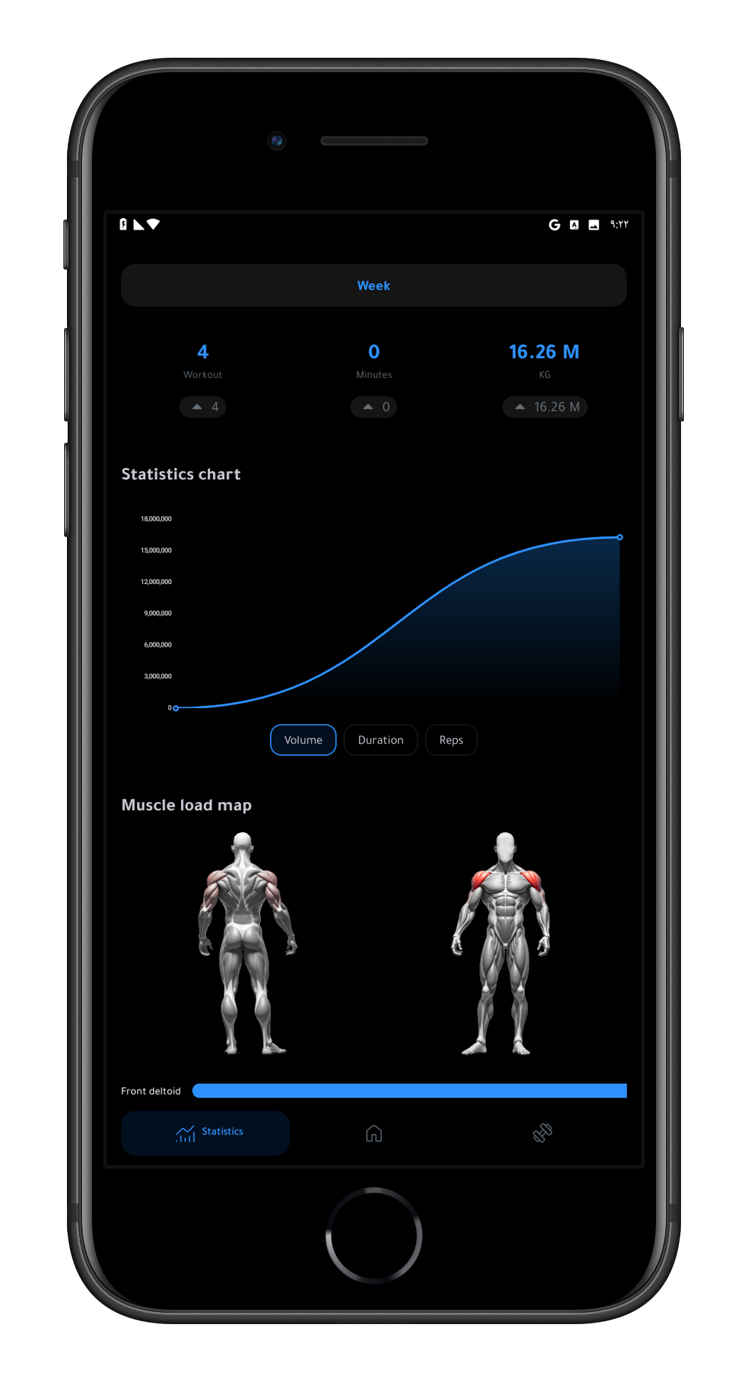
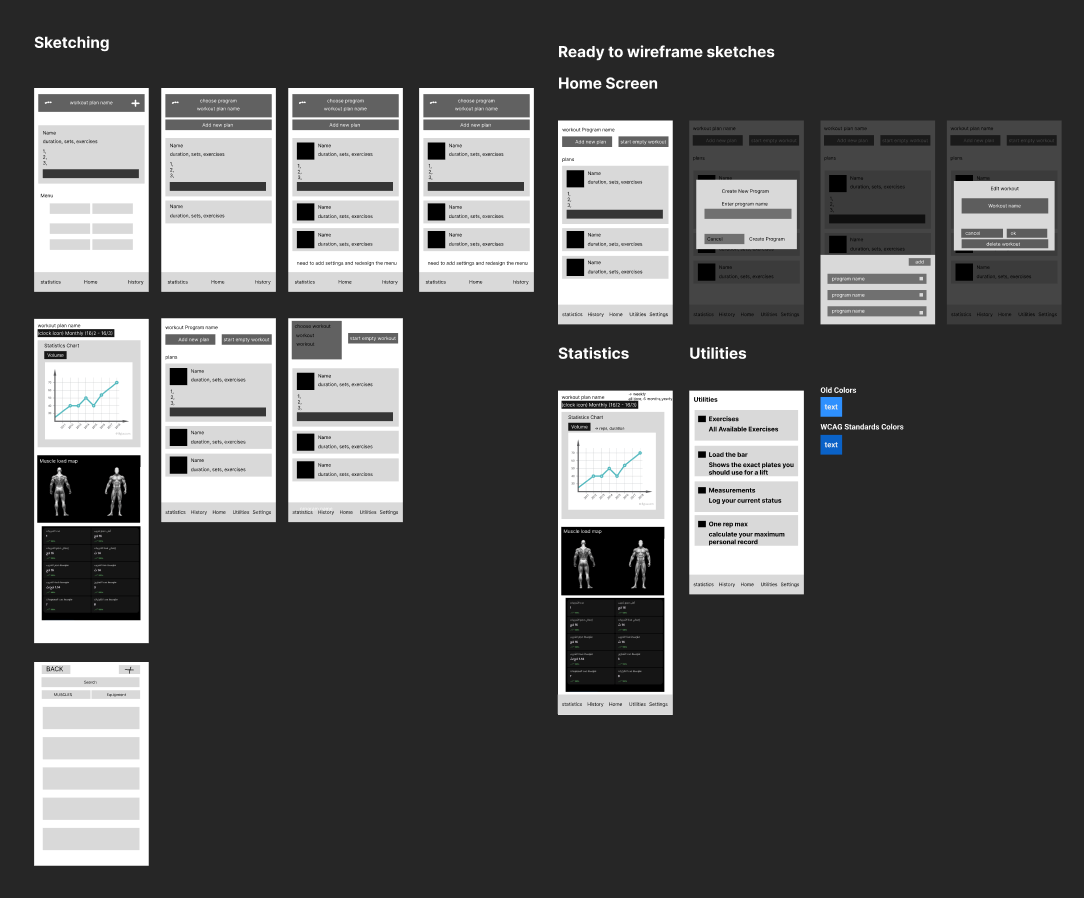
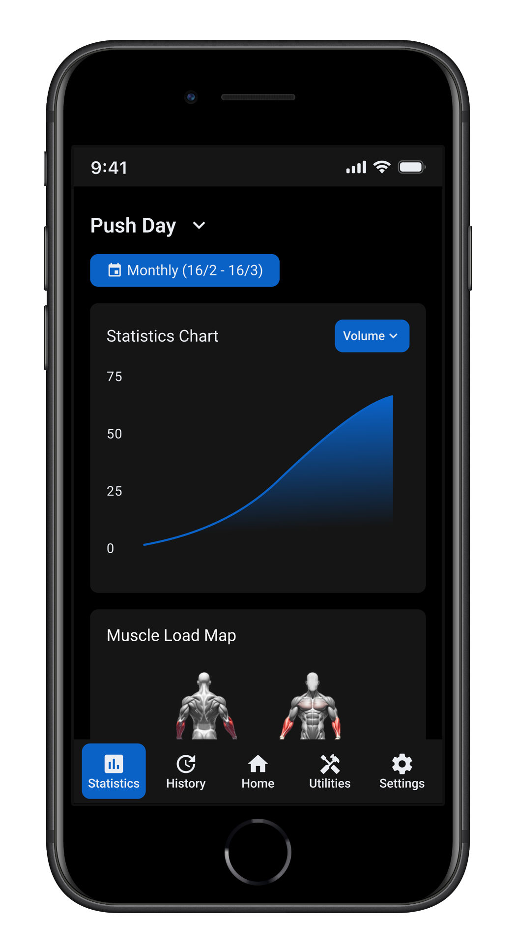
Workout Log — Android App Redesign
Workout Log is an Android app for tracking gym sessions. As a daily user, I identified three recurring friction points that were making the app harder to use than it needed to be: a misleading statistics chart, cluttered home screen and a broken exercise search. I redesigned the app as a solo project, applying UX principles and WCAG AA accessibility standards throughout.
Problem 01
The chart combined volume from all workout days into a single graph. Comparing leg day volume to push day volume on the same chart is meaningless — they are completely different workouts. A user trying to measure progress had to manually count backwards through the chart to find the last time they did the same workout.
Problem 02
Settings was buried inside a utilities menu grid, which was itself sitting on the home screen with no clear reason to be there. It took 3 days to find it, and only by accident. Nielsen's heuristic #6 — recognition over recall — exists precisely for this reason: users should never have to hunt for a feature as fundamental as settings. on the a phone screen everything was bigger, meaning the utilities grid was actually buried down and you had to scroll to see it.
Problem 03
multiple different exercises shared the name "Bench Press." The only difference between them was the equipment, shown in a small subtitle. Searching for "flat bench press" returned nothing. Users had to filter by muscle group and scroll through the entire list visually — making search completely pointless.
I used Workout Log daily for 45 days before touching Figma. Every problem I solved was something I personally ran into as a real user. Self-ethnography was the natural research method — living with a broken product for long enough gives a level of context that a one-week audit never would.
Research method 1
I kept using the app specifically because I could see its potential as a case study while I was still learning UX. Every moment of friction was documented in "I wanted to X but Y happened" format. The recurring patterns became the problem statements.
Research method 2
I downloaded Hevy and MuscleMonster, both with millions of downloads, to understand what design decisions were working at scale.
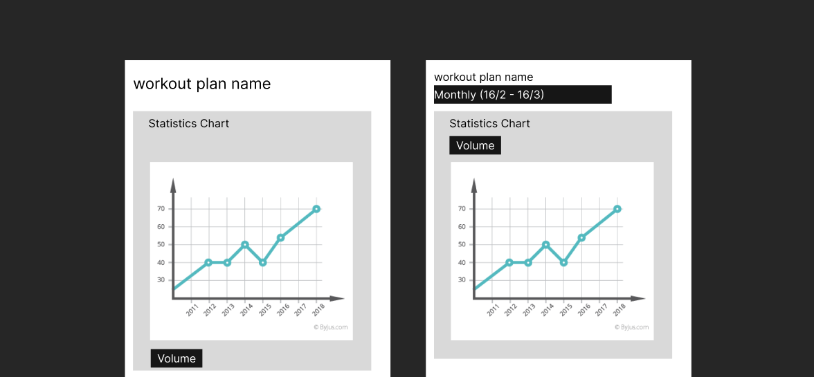
The first sketch had the workout selector replacing the timespan selector entirely. After reviewing it, it became clear users might still want to filter by time — the final solution kept both. The workout selector became the primary control and the timespan selector became a secondary button underneath it.
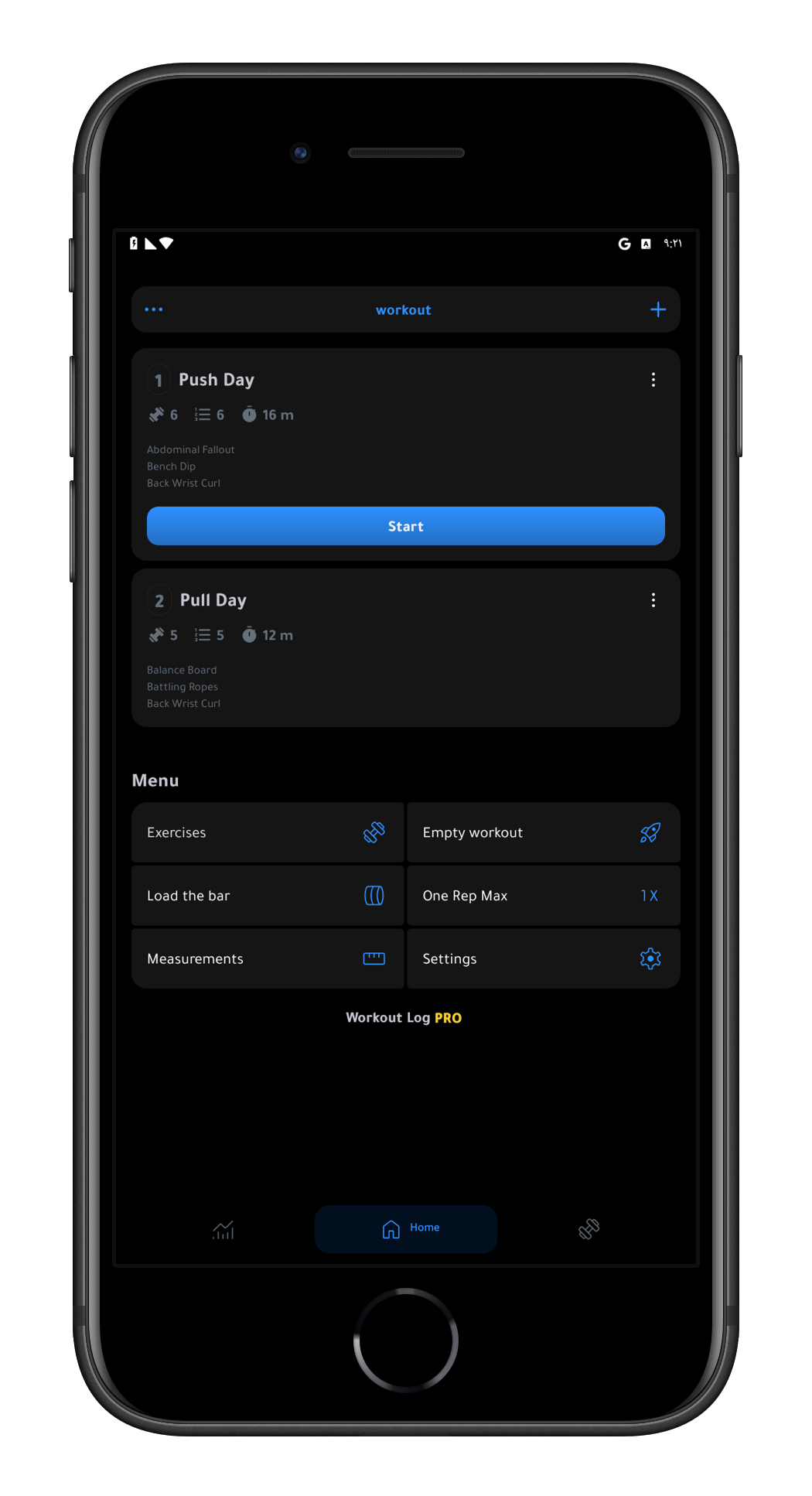
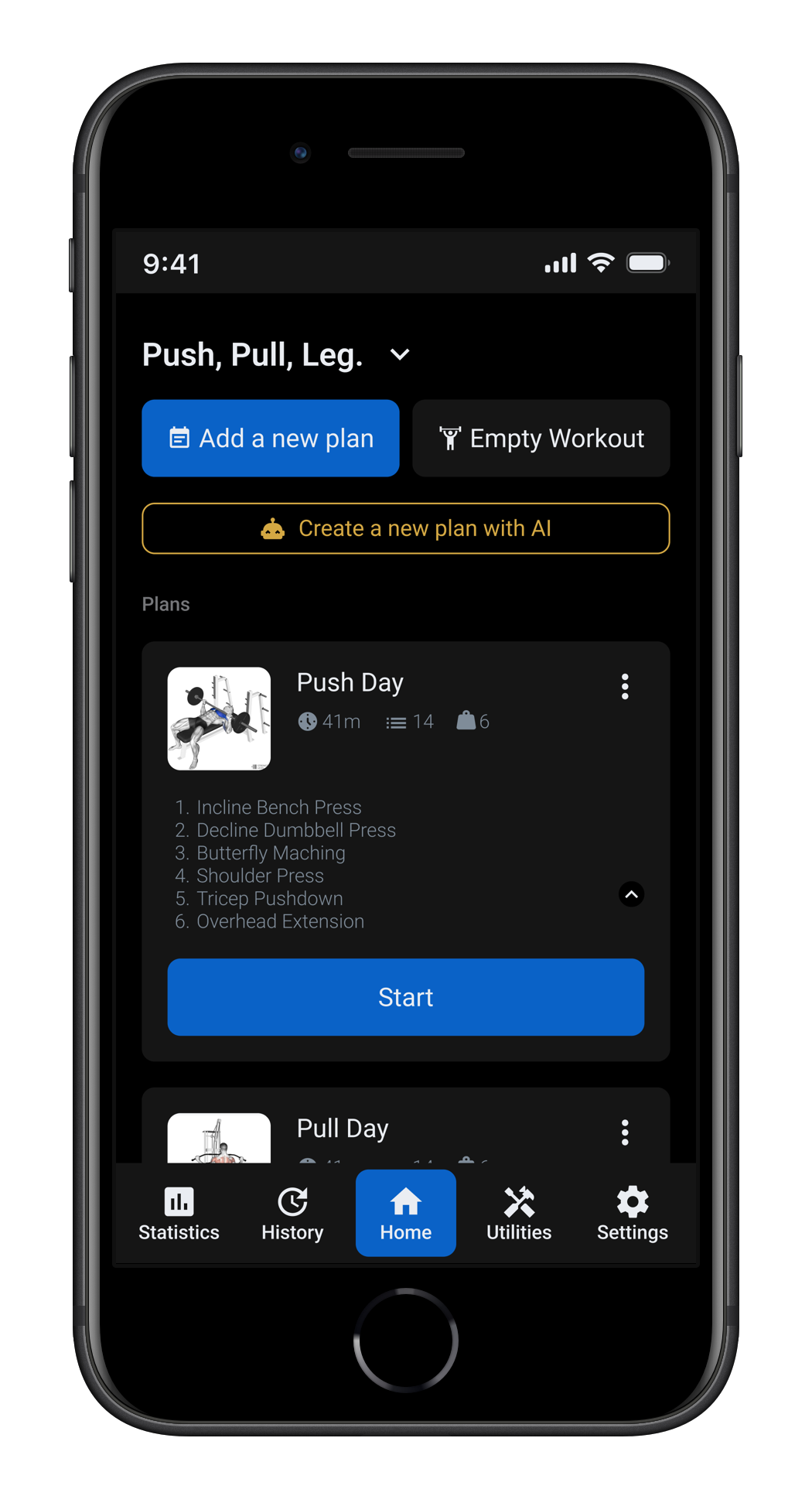
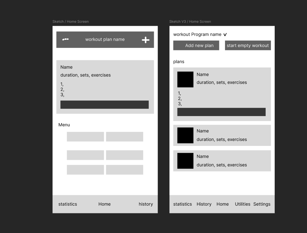
The original program selector was a plain text label centered at the top of the screen with no visual indication it was interactive. In the redesign it moved to the top left as a header with a chevron next to it, making it immediately clear that tapping opens a menu to switch programs. The utilities grid was removed from the home screen entirely and given its own screen in the nav bar.
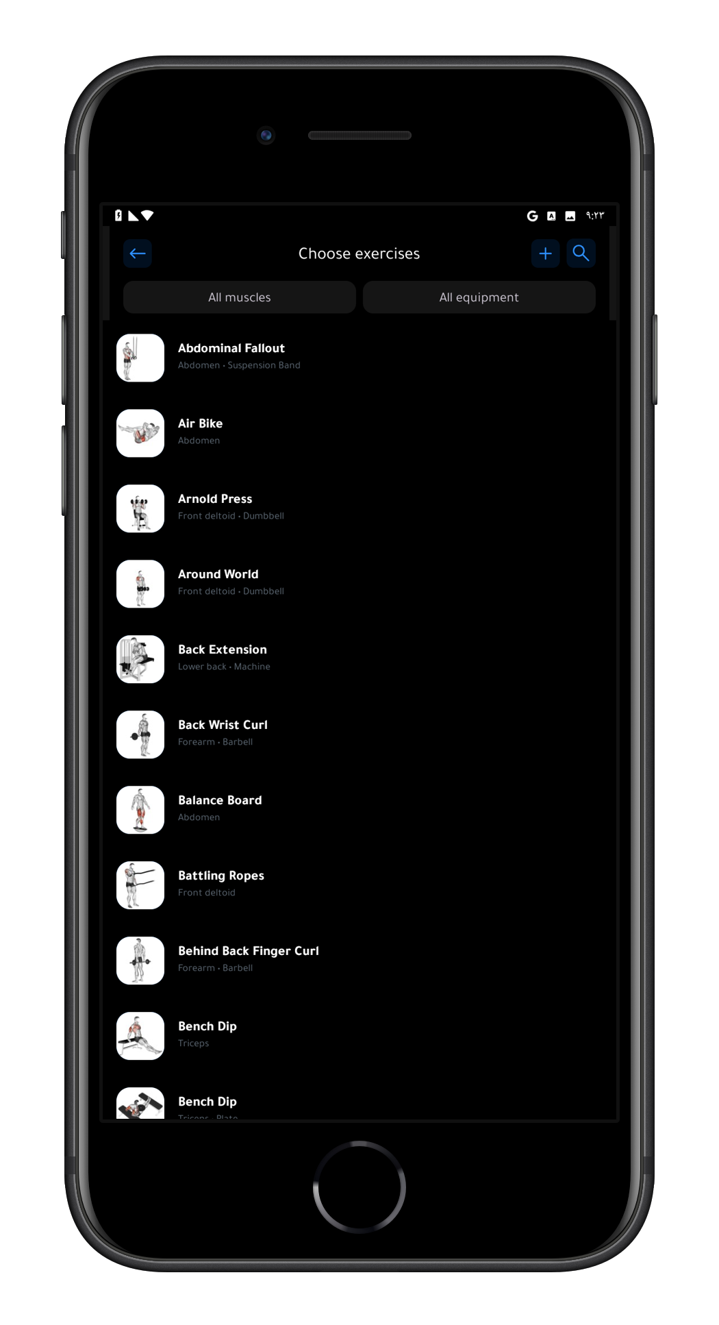
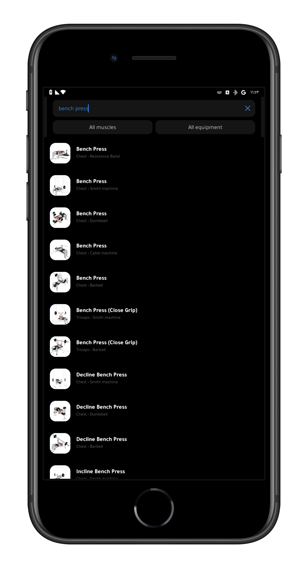
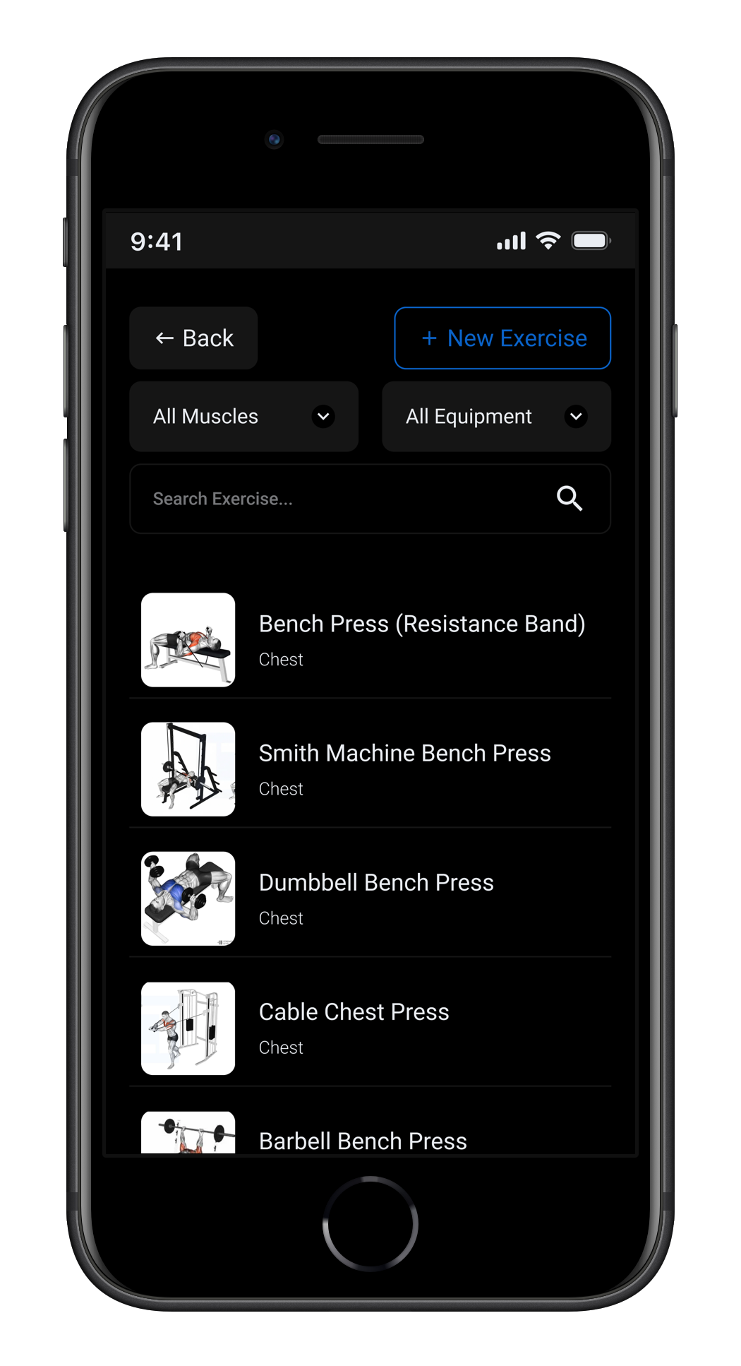
MuscleAndStrength.com was chosen as the single source of truth for all exercise names. Every exercise got its full descriptive name as the title — "Dumbbell Bench Press", "Smith Machine Bench Press", "Barbell Bench Press" — and the subtitle was reduced to muscle group only. Equipment no longer lives in the name; it is the name.
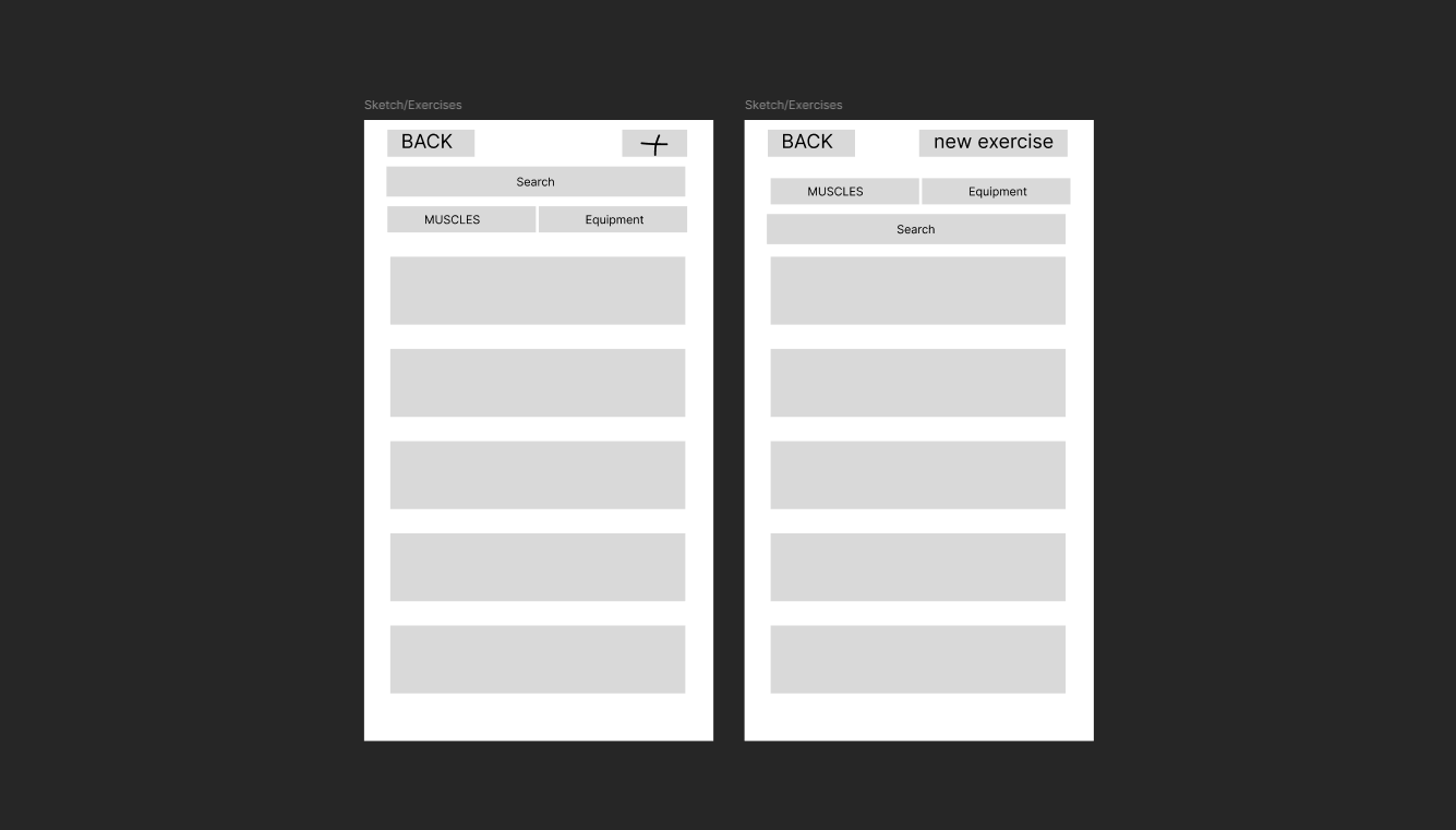
For every element on the screen, one question was asked: does this label tell the user what to do, or does it make them guess? That question drove every change — from replacing the plus icon with a "New Exercise" button to replacing the hidden search icon with a visible, always-present search bar.
The original primary blue (#2E90FE) had a contrast ratio of 2.73:1 against white — well below the 4.5:1 WCAG AA minimum. It was darkened to #0A62C7, which passes the standard while keeping the same visual identity. Every screen was then verified using the Contrast plugin in Figma.
Every interactive element has a minimum tap area of 48×48dp. Smaller visual elements like chart toggles and timespan selectors have an invisible 48×48dp frame on top as the actual tap target — so the visual design stays clean without sacrificing usability.
No text in the design goes below 12px, ensuring readability across different screen sizes and vision abilities. The minimum applies to every label, caption, and secondary element in the interface.
06 — Reflection
This was my first case study as a UI/UX designer. The most important thing I learned is that good design is mostly good reasoning — every change needs a specific reason, and every reason should come from a real problem. If I were to do this again, I would involve other gym users earlier rather than relying entirely on my own experience. My usage patterns are not universal, and there are likely friction points I missed because they never affected me personally.
"The accessibility work was the most technically demanding part of the project and the part I am most proud of. It is easy to make something look good. It is harder to make something that works for everyone."